All eyes turn to New York this week for the marquee drawings sales at Sotheby’s and Christie’s, where Rembrandt’s lion and the much-lauded collection of Diane A. Nixon face off against Michelangelo’s foot. Across the Upper East Side, the multi-venue fair Master Drawings New York, with its 36 international exhibitors, continues until 7 February, enriched by a programme of live events organised by The Drawing Foundation. Many thanks to all who attended our own collaborative event on Sunday. Special thanks go to our event partners, The Drawing Foundation, our hosts, Sotheby's, our wonderful panellists, Olenka Horbatsch, Sarah Mallory, Elizabeth R. Mattison and Anita V. Sganzerla and our co-moderator, Greg Rubinstein. A recording of the event will be available in due course.
Looking further ahead, the National Museum Cardiff opens a major retrospective on Gwen John, the first exhibition devoted entirely to the Welsh-born artist in over forty years. The show opens on 7 February and will go on to tour to partner galleries in Scotland and the U.S. throughout 2026 and 2027. This follows on from last week’s opening at the Courtauld Gallery of an intimate exhibition devoted to landscape drawings by British women artists working between 1760 and 1860. In Rome, the Palazzo Barberini marks the 400th anniversary of the consecration of the new St Peter’s Basilica with an exhibition on Gian Lorenzo Bernini and Maffeo Barberini, opening on 12 February. In London, Lucian Freud: Drawing into Painting opens at the National Portrait Gallery on 14 February. Meanwhile, in Paris, three galleries host standout exhibitions: drawings by Léon Spilliaert at David Zwirner, those of the Tiepolo family at Galerie Eric Coatalem, and works by Auguste Allongé at Galerie Motte Masselink.
Inside this month’s magazine, we have a trio of British special features. From the Trois Crayons Museum, a submission of a Northern landscape drawing from the Hood Museum of Art, which is followed by an overview of news headlines, gallery listings, events and recent institutional acquisitions. Rachel Sloan, curator of the newly-opened exhibition A View of One’s Own: Landscapes by British Women Artists, 1760-1860 selects the Drawing of the Month. Global exhibition listings are followed by the second installment of our collector profiles series. In this Demystifying Drawings feature Daniel Lowe explores the life and Guercino drawings of the eighteenth-century British antiquarian John Bouverie. Nigel Ip reviews Turner & Constable: Rivals & Originals at Tate Britain, London, casting a close lens over the works on paper sections, and lastly, after the Real or Fake quiz, we have a trio of audio, video and literary recommendations for the month.
For next month’s edition, please direct any recommendations, news stories, feedback or event listings to tom@troiscrayons.art.
Tom Nevile
Editor
Museum Partner Spotlight: Hood Museum of Art
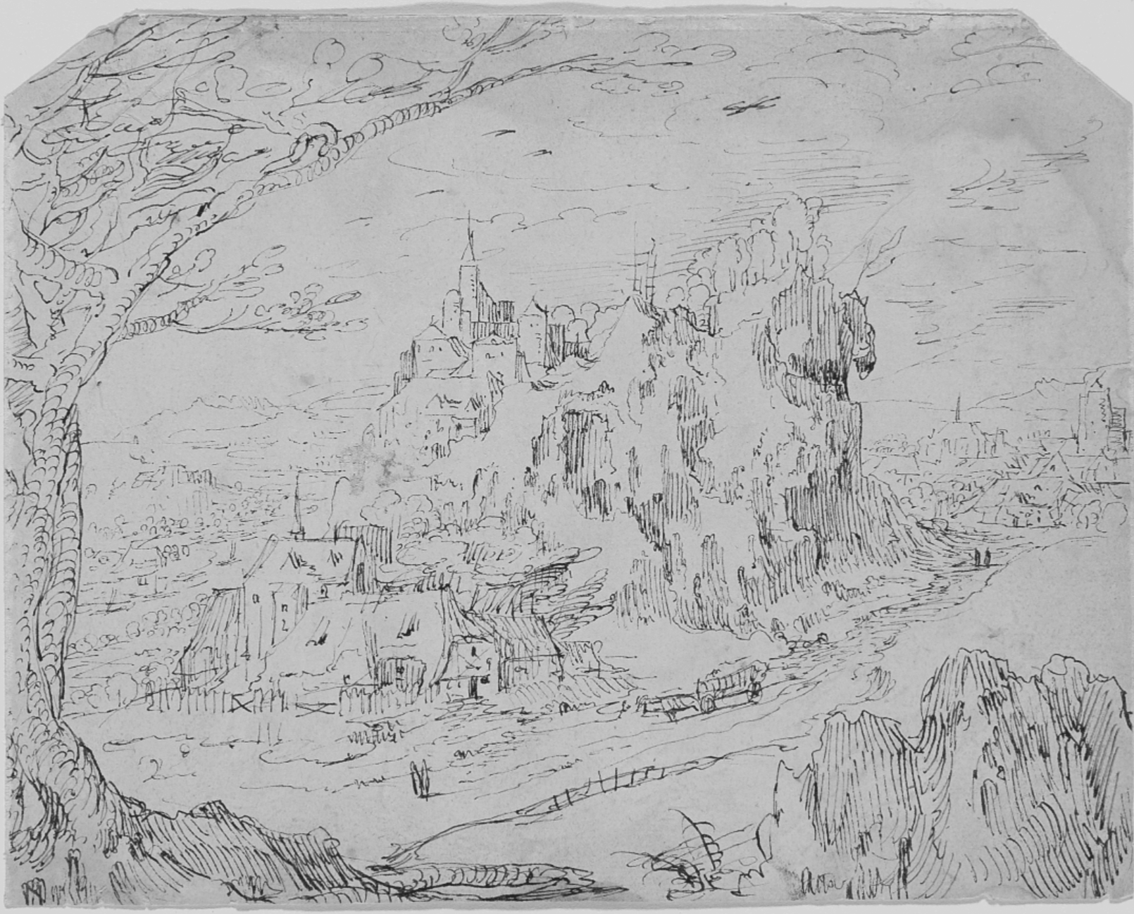
Credit: Gift of Mrs. Hersey Egginton in memory of her son, Everett Egginton, Class of 1921
This month’s selection from the Trois Crayons Museum Forum is a pen and ink landscape drawing from the Hood Museum of Art, Dartmouth College: Mountainous Landscape (obverse); Man and Woman before a Beggar (reverse) formerly attributed to Jan van Almeloveen and Jacob Esselens. Although no satisfactory attribution has been proposed since the drawing’s arrival at the museum, recent suggestions on the forum have argued for an attribution to Coenraat van Schilperoort, Master of the Budapest Sketchbook.
Curator’s comments: This drawing has been in the museum’s collection for over 70 years and has never been studied or exhibited; it has never been published or received a secure attribution. On the obverse is a mountainous landscape, framed by rocks and a tree in the foreground. On the reverse, a man in a cloak with a woman, standing before a naked beggar on the ground. A collector’s mark on the reverse indicates the drawing was in the collection of Wilhelm Koller in Vienna in the 19th century, although the drawing cannot be positively identified with any of the works described in the auction at the end of his life. It may have been included in one of the larger group lots at the sale. Only two attributions have been tentatively proposed, to landscape artists Jan van Almeloveen and Jacob Esselens, although neither is satisfactory.
To register as a museum partner, please email info@troiscrayonsforum.org.
IN GALLERY, ART FAIR AND AUCTION NEWS
Master Drawings has announced the appointment of Robert Fucci as the new editor of the journal. A specialist in seventeenth-century Dutch and Flemish art, he succeeds Jane Turner who retired last year following 22 years of service.
The Tate and the Paul Mellon Centre have completed their collaborative cataloguing project of the sketchbooks of J.M.W. Turner. The project has seen the cataloguing and digitisation of 37,00 drawings, sketches and watercolours by the artist.
The auctioneers Beaussant Lefèvre & Associés and the Cabinet de Bayser, have unveiled a rare silverpoint drawing by Hans Baldung Grien, which will come to auction in Paris in March. Remarkably, the drawing has remained in the same family for over 500 years.
The auction house Bonhams will open a new U.S. flagship in New York this month at 111 W 57th Street.
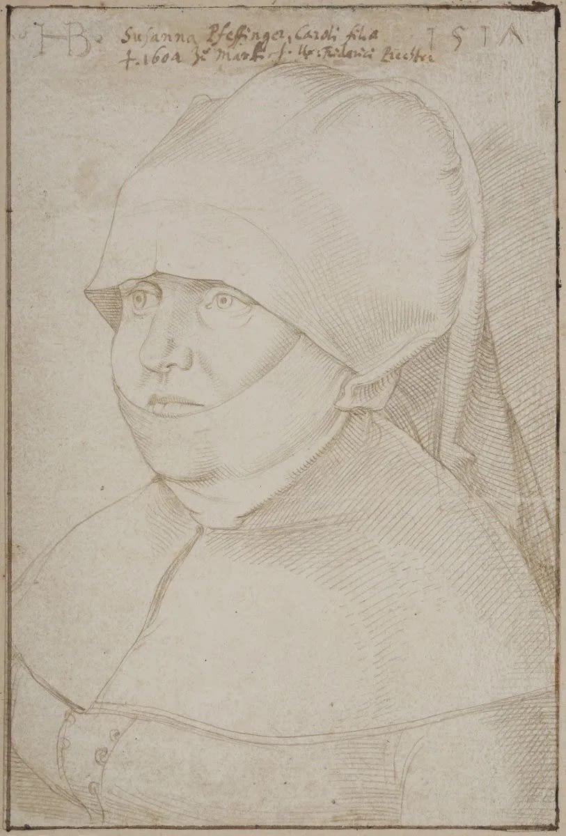
Hans Baldung Grien, Portrait of Susanna Pfeffinger (Sélestat 1465 – Strasbourg 1538), wife of Friedrich Prechter, shown bust-length, three-quarter view facing left, 1517. Image courtesy: Hotel Drouot, Paris.
IN GALLERY, ART FAIR AND AUCTION NEWS
4 February – Master Drawings from the Collection of Diane A. Nixon at Sotheby’s, 10:00 (New York).
4 February – Master Works on Paper from Five Centuries at Sotheby’s, 14:00 (New York).
5 February – A Life of Discerning Passions: The Collection of H. Rodes Sr. and Patricia Hart: Live at Christie’s, 10:00 (New York).
5 February – Old Master and British Drawings at Christie’s, 12:00 (New York).
Until 6 February – Nicolas Eekman A fantastic universe (1889 - 1973) at Native auctions presented by Native and Mathieu Néouze (Brussels).
Until 7 February – Master Drawings New York at various venues (New York).
7–15 February – Modenantiquaria at Modena Fiere (Modena).
12–15 February – Art on Paper Amsterdam at De Kromhouthal (Amsterdam).
12–17 February – The Palm Beach Show at Palm Beach Convention Center (West Palm Beach).
13 February – 3 April – Les Tiepolo dans les Collections Privées at Galerie Eric Coatalem (Paris).
Until 15 February – Fin de Siècle at Emanuel von Baeyer, 18 Cecil Court (London).
18 February – 13 March – Peaks & Glaciers 2026 at John Mitchell Fine Paintings (London).
19 February – 7 March – British Works on Paper, including drawings from the Study Collection of Professor David Bindman (1940-2025) at Abbott and Holder (London).
20 February – 11 April – Nature Revealed: Drawings by Auguste Allongé (1833-1898) at Galerie Motte Masselink (Paris).
Until 7 March – Les Jardins: 17th – 20th century European Garden Plans & Natural History at Victoria Munroe Fine Art (New York).
Until 28 March – Léon Spilliaert at David Zwirner (Paris).
IN LECTURE AND EVENT NEWS
Until 7 February – Event series: Drawings Week 2026 at various venues (New York). Free with registration.
11, 18, 25 February – Online short course: Stories Across Time and Place at the Morgan Library & Museum (New York). Tutors: Pinar Durgun, Sarah Mallory, Jesse Erickson. $65.
19–21 February – Conference: The Renaissance Society of America San Francisco 2026 at Hilton San Francisco Union Square (San Francisco). $270.
25 February – Lecture: Stevenson Lecture | Richard Oswald’s Library: Slavery, Collecting, and the Invention of Rare Books at the Woburn Suite, Senate House (London). Speaker: Professor Emma Smith, University of Oxford. 18:00. Free with registration.
27 February – Talk: The Patrons of the Renaissance at The King’s Gallery, Palace of Holyroodhouse (Edinburgh). Speaker: Martin Clayton. 13:00. £6.
20–23 April – Short course: “The Root of Everything” – Drawing in Europe from the Renaissance to the Modern Period at The Courtauld (London). Tutors: Rachel Sloan, Rachel Hapoienu, Kate Edmondson. £545.
12 June – Symposium: In the margin? Works on paper by Dutch and Belgian amateur artists, ca. 1550–1850 at Teylers Museum (Haarlem). Organised by Teylers Museum and Delineavit et Sculpsit. Programme and registration details TBC.
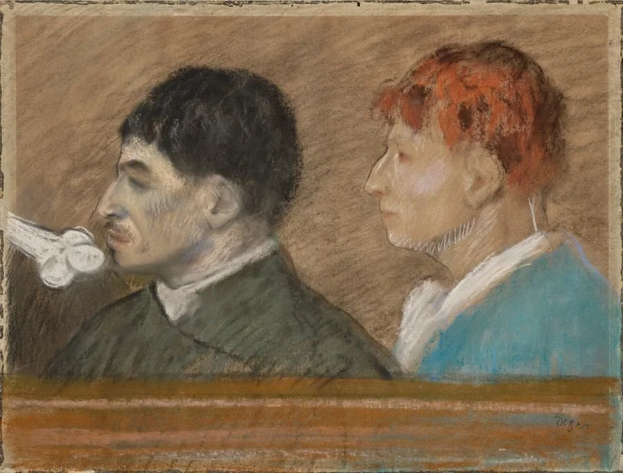
Edgar Degas (1834-1917) Physionomie de criminel, 1880-1881 Musée d'Orsay © Christie’s Images Limited, 2025
IN LITERARY, MUSEUM AND ACADEMIC NEWS
New publication – Constable’s Year: An Artist in Changing Seasons, Susan Owens. Published by Thames & Hudson. £25.
New publication – L’IDEA. Fascicolo 2 - Disegni • Anno II • 2025. Open access.
Call for papers – Views of their Own: Rediscovering and Re-presenting the Work of Women Artists at The Courtauld Institute of Art, London. Application deadline: 6 February. Conference date: 13 March.
Call for papers – The History of Drawings. Conservation and Its Ethics, organised by the J. Paul Getty Museum and the Rijksmuseum, hosted online. Application deadline: 13 February. Conference dates: 12–13 May.
Job opportunity – Curator at The Barber Institute of Fine Arts, Birmingham. Application deadline: 1 February.
Job opportunity – Curator of Southern European Art at Ashmolean Museum, Oxford. Application: 11 February.
Job opportunity – Curatorial Assistant, Drawings and Prints at MoMA, New York.
Job opportunity – Reviews Editor at the Association for Art History’s Art History journal. Application deadline: 27 February.
Funding opportunity – Scholarship for the study of French 18th-century fine and decorative art, The Burlington Magazine. Grant: £12,000. Application deadline: 31 March.
IN ACQUISITION NEWS
Ecole de Fontainebleau c. 1590–1600, Projet de plat avec une bacchanale des Andriens. Acquired by the Petit Palais, Paris, from Artcurial, Paris (sale 26 March 2025).
Jean-Baptiste Greuze (1725–1805), La première récolte de blé du fils du cultivateur. Acquired by the Petit Palais, Paris, from Artcurial, Paris (sale: 26 March 2025).
The Musée d’Orsay has announced several recent acquisitions:
- Edgar Degas (1834–1917), Physionomie de criminel. Acquired from Christie’s, Paris (sale: 24 October 2025).
- Marie-Désiré Bourgoin (1839–1912), Le deuil du peintre Ernest Meissonier.
- Maurice Denis (1870–1943), 240 preparatory drawings for L'Imitation de Jésus-Christ.Arts Council England has published its Cultural Gifts Scheme & Acceptance in Lieu report for 2025, detailing the important cultural objects transferred to the nation in lieu of Inheritance Tax. Amongst the highlights is Danseuses roses, a pastel by Edgar Degas (1834-1917), which has been permanently allocated to the National Gallery, London.
Théophile Schuler (1821–1878), L'inondation de Rhinau du 19 septembre 1852. Acquired by the Cabinet des Estampes et des Dessins de Strasbourg, Strasbourg (source: Facebook).
Mary Smirke (1779–1853)
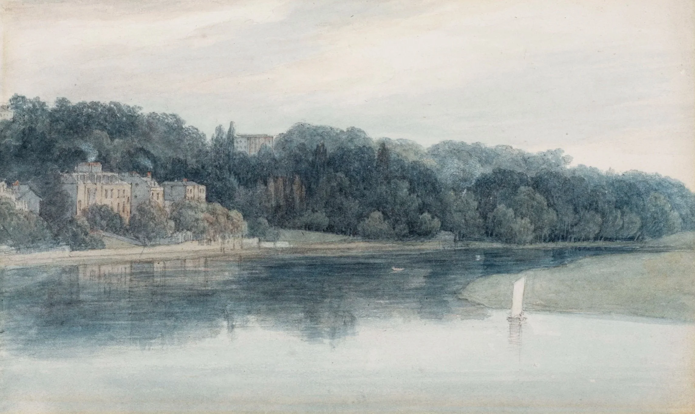
The Thames near Richmond, c. 1811
Graphite, watercolour and opaque watercolour on wove paper, 127 x 205 cm. Private collection. Promised gift to the Samuel Courtauld Trust.
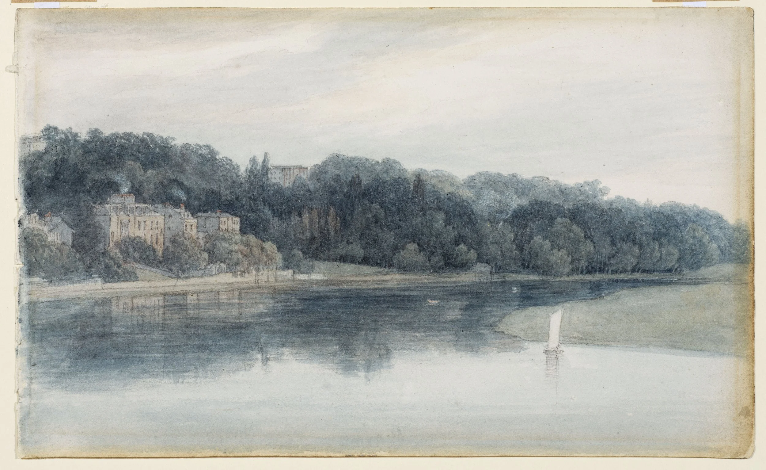
Mary Smirke (1779–1853), The Thames near Richmond, c. 1811. Private collection. Promised gift to the Samuel Courtauld Trust
Niamh MacNally, curator of Rembrandt to Matisse – A Celebration of European Works on Paper, has kindly chosen our drawing of the month.
It is no easy task to select a single highlight from A View of One’s Own: Landscapes by British Women Artists, 1760-1860 (currently on view in the Gilbert and Ildiko Butler Drawings Gallery at the Courtauld Gallery, through 20 May). The ten artists included in the show all deserve their time in the spotlight, and it is a privilege to be able to share their drawings, which range from private topographical sketchbooks to ambitious exhibition pieces, with the public in some cases, for the first time.
One of the most compelling works in the show, however, is also one of the smallest. This view of a quiet stretch of the Thames west of London by the watercolourist and draughtswoman Mary Smirke possesses wall power in inverse proportion to its diminutive size. When I first opened the mount to examine the drawing, I was surprised to see the remnants of sewing holes along the left margin of the sheet, indicating that this meticulously composed and beautifully realised landscape had been made on a page of a sketchbook – not a format usually associated with highly finished drawings. Yet a sketchbook would have been easy to use in front of the motif, given where the artist placed herself to capture her subject: Smirke must have been working from a boat positioned mid-stream. The pallor of the partly overcast sky and the minimal water traffic – a single sailboat at right, one or perhaps two tiny skiffs further downstream – suggest that she went out early in the day, the better to capture the river at its most tranquil, all the more important as she was most likely working near the Twickenham ferry crossing. (I’m grateful to Julia DeFabo and Andrew Chater of the Orleans House Gallery for their kind assistance in identifying the location, which is rather more built up today.)
On this small sheet, Smirke used correspondingly fine brushes to render the glassy reflections of the river’s surface, the areas of sky visible between wispy clouds – an adroit use of the reserve – and the billowing foliage of the trees lining the left bank. There is something of a miniaturist’s precision and control in her touch, and at the same time an exquisite sense of atmosphere conjured by the translucent blue-grey and green washes. The scene exudes an almost palpable stillness and quiet. This potent combination of remarkable attention to detail and small size likely explains why The Thames near Richmond was hung in the most coveted space in the Royal Academy when it was exhibited there in 1812 – the Great Room.
Mary Smirke had ambitions for her art in a period when the deck was decisively stacked against female artists. She exhibited at the Royal Academy every year between 1809 and 1814, not as an honorary exhibitor, as was common for women at the time, but as a ‘full’ exhibitor, with her address always listed in the back of the catalogue for the benefit of potential buyers. The hobbling of her career follows sadly familiar lines: she ceased exhibiting after 1814 because of increasing domestic responsibilities, although she continued to draw and paint for the rest of her life. It is a truism that many successful historic women artists enjoyed access to training and further opportunities thanks to fathers, brothers and husbands who were artists themselves, but Smirke’s male relatives were as much a hindrance as a help. During her years as an exhibitor her father, the Royal Academician Robert Smirke (1752-1834), served on the hanging committee, something which proved a double-edged sword when, in 1810, he had her work removed from the exhibition because he was dissatisfied with its placement. Never mind that his daughter was thirty-one and had had her work in the Great Room the previous year – as a man, and her father, he had the final say.
It is all the sweeter, then, that despite her father’s actions, Mary Smirke returned to the Royal Academy the following year, and then the year after that, with this exquisite watercolour – and that today, it hangs once again on the walls of the north block of Somerset House, the historic home of the Royal Academy.
A View of One’s Own: Landscapes by British Women Artists, 1760-1860 at the Courtauld Gallery is open until 20 May.
Collector profiles: John Bouverie’s Guercino Drawings
Daniel Lowe, Contributing editor
The Emilian painter and draughtsman Giovanni Francesco Barbieri, known as Guercino (1591-1666) had well-recorded distaste for England and the English. The biographer Carlo Cesare Malvasia noted that upon being invited to the court of Charles I in the mid-1620s, the artist rebuffed the sovereign’s tempting offer of market rates for every painting produced, on top of a yearly wage and paid expenses. His justification? ‘He did not wish to accept the offer, not wanting to converse with heretics (so as to not taint his angelic ways). Furthermore, he did not want to endure such a treacherous voyage, in a climate so different from his own’. (C.C. Malvasia, Felsina Pittrice, Bologna 1678, II:366, translation mine).
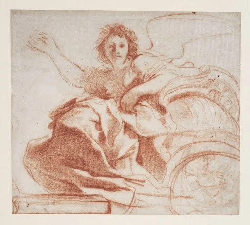
Giovanni Francesco Barbieri, called Guercino, Aurora, c. 1620. Red chalk with stumping on laid paper, 24.8 x 27.1 cm. Courtauld Gallery, London (Samuel Courtauld Trust). Image courtesy of the Courtauld.
Despite the artist’s aversion to the climate of England and the ‘heretic’ Protestantism of its inhabitants, nowhere has the work of Guercino — especially his drawings — found greater acclaim. Some significant early English collections of his sheets included that of the painter Peter Lely, William Cavendish, fourth Earl (and future first Duke) of Devonshire, the dealer William Kent; and even George III, who acquired a considerable number of Guercino drawings through his librarian Richard Dalton.
Above all of these well-known and widely studied collectors, however, one towers above the rest. I speak, naturally, of the archaeologist and traveller John Bouverie, who, in the span of just a few years, amassed what the connoisseur Henry Reveley described as ‘perhaps the finest collection of Guercino’s drawings in England’ (1820). Despite the importance of Bouverie’s collection of Guercino drawings, before Nicholas Turner and Carol Plazzotta’s seminal catalogue Drawings by Guercino from British Collections (1991), virtually nothing was known about the young English collector. The biographic profile that follows is greatly indebted to Turner and Plazzotta’s publication, and equally to an article in the Burlington Magazine on the same subject, also by Turner (1994).
John Bouverie was born around 1722 to a wealthy family. Before finishing his MA at New College Oxford, Bouverie undertook a Grand Tour between 1740 and 1742, with his tutor John Clephane. The young collector embarked on his journey with considerable financial liquidity, having inherited a large fortune following the death of his father and elder brother.
Bouverie seems to have made his first acquisition of a volume of Guercino sheets from a certain ‘Abbé Bonducci’ in Florence, cinching it from the clutches of Horace Walpole, another avid English collector. Recorded again in Italy between 1745 and 1746, Bouverie purchased another large collection of drawings of the artist from the Bolognese dealer Francesco Forni (sometimes mistakenly spelt ‘Formi’).
In 1750, having embarked on yet another Mediterranean expedition, Bouverie fell ill and died. His formidable collection of drawings — which also contained works by the likes of Rembrandt, Carlo Dolci, and a series of portrait drawings, once attributed to Holbein and currently given to Clouet and his workshop — were passed to his sister Anne (d. 1757). After bouncing through his family, the sheets were eventually inherited by the Earls of Gainsborough, who began to significantly disperse the collection, notably through a first sale at Christie’s in 1859, and subsequently through a series of larger sales in the 1920s.
Today, most of Bouverie’s drawings have been snapped up by various museums, both in the UK and further afield. Standouts include the atmospheric Landscape with a Volcano now at the Morgan Library in New York, the pen-and-ink Two seated women drying their hair in front of a fire, and the red-chalk Aurora. These last two sheets (illustrated) are bothat the Courtauld Gallery in London, the home of an important nucleus of around thirty Guercino drawings that once belonged to John.
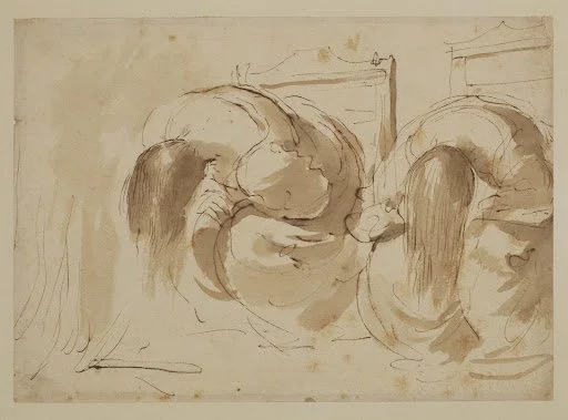
Giovanni Francesco Barbieri, called Guercino, Two seated women drying their hair in front of a fire, c. 1635. Pen and brown ink, brown wash on laid paper, 18.9 x 26.2 cm. Courtauld Gallery, London (Samuel Courtauld Trust). Image courtesy of the Courtauld.
While there is no one definitive ‘smoking gun’ for associating sheets to the Bouverie collection, here are four characteristics to look out for:
A capital B stamp in the corner of the sheet (L. 325). This mark is thought to have been applied to ex-Bouverie drawings before the 1859 sale (see the lower left-hand corner of Amnon and Tamar from the National Gallery of Art, illustrated);
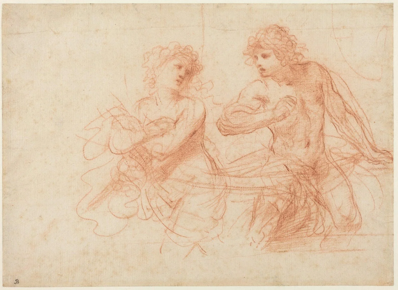
Giovanni Francesco Barbieri, called Guercino, Amnon and Tamar, 1649. Red chalk on laid paper 18.9 x 26.1 cm. National Gallery of Art, Washington DC.
A number written in pencil at the lower left-hand corner of the sheet; possibly an inventory or shelf mark applied by one of the Earls of Gainsborough (see the Saint Francis receiving the stigmata from the Courtauld Gallery, illustrated);
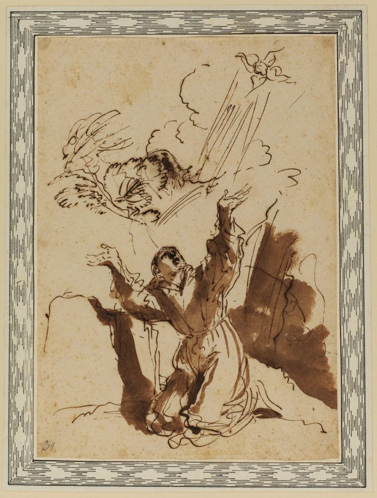
Giovanni Francesco Barbieri, called Guercino, Saint Francis receiving the stigmata, c. 1642. Pen and brown ink, brown wash on laid paper, laid down on a ‘Casa Gennari’ mount , 25.8 x 18.4 cm. Courtauld Gallery, London (Samuel Courtauld Trust). Image courtesy of the Courtauld.
Specifically for Guercino drawings: the presence of a characteristic ‘Casa Gennari’ mount, formerly thought to have been applied directly by the artist’s descendants. The mount is on Italian paper with geometric decorations made with ruled lines of ink (again, see the Courtauld Saint Francis);
The former presence of one of these mounts, indicated by regularly spaced dots of glue residue.
Though the scholarly understanding of Bouverie’s collection has greatly increased in the past few decades, some significant questions about this seminal collector remain wide open, notably around the ‘Casa Gennari’ mounts. Given that these Italian-paper backings are exclusively associated with former Bouverie sheets, one working hypothesis is that John worked with Forni or Bonducci to have them decorated before shipping them to England. However, the lengthy process of decorating each mount with a unique geometric pattern chosen to flatter the drawing seems uncharacteristic of a dealer. Qualcosa non torna, as the Italians would say.
Although there are still several questions left to answer about John Bouverie, the influence of his collection is beyond doubt. A trailblazing trend-setter, Bouverie’s passion for Guercino drawings helped make them a quintessential part of a distinct ‘English taste’, which persisted centuries after the young collector’s untimely death.
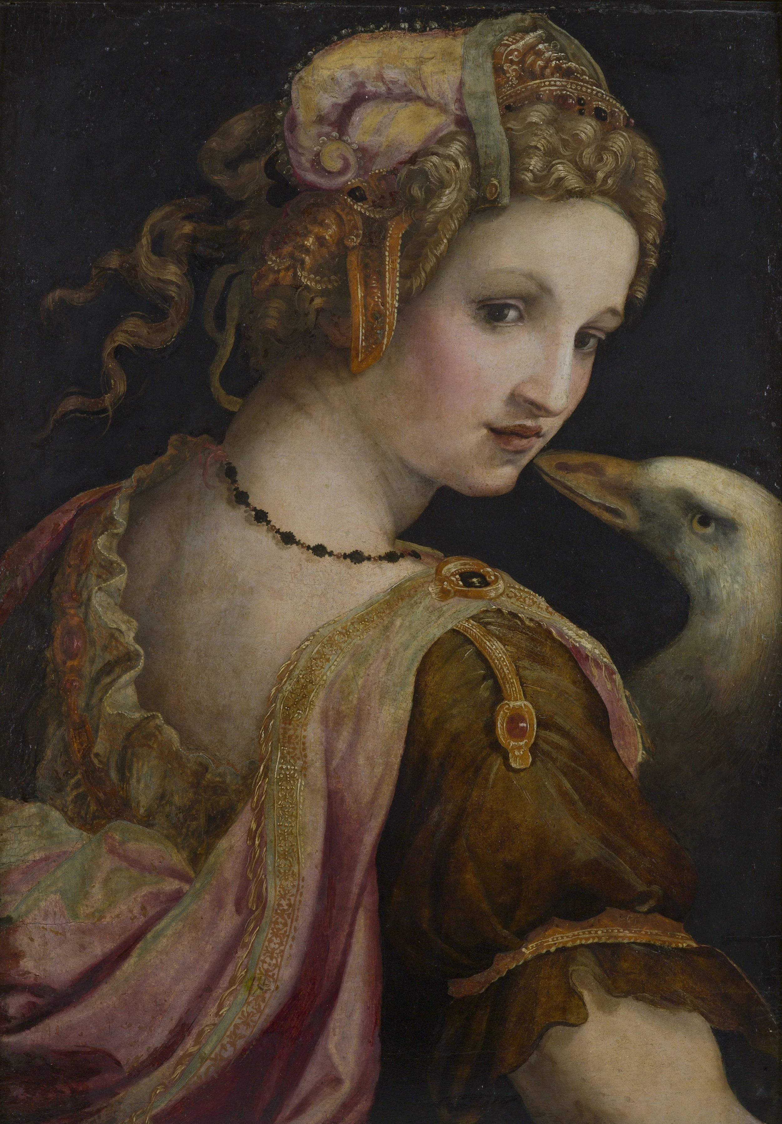
Michele Tosini, Leda, ca. 1560–70. Galleria Borghese, Rome
Turner & Constable: Rivals & Originals
Tate Britain, London
27 Nov 2025 – 12 Apr 2026
Nigel Ip, Print Quarterly
For over 200 years, Joseph Mallord William Turner and John Constable have been entwined in a heated rivalry to become Britain’s favourite landscape painter. While the former’s self-portrait graces the latest £20 note in front of The Fighting Temeraire, Constable has received no such acclaim beyond local association with an area of the River Stour dubbed ‘Constable Country’.

Ramsay Richard Reinagle, John Constable, c. 1799. NPG 1786. © National Portrait Gallery, London.
Celebrating the 250th anniversary of the birth of both artists – born in 1775 and 1776, respectively – the exhibition at Tate Britain seeks to highlight their original contributions and divergent pathways towards the genre. Turner discovered fame early on as a city boy in London, becoming the youngest student at the time to be admitted into the Royal Academy Schools, aged 14, and a full Academician at 27. His commercial success helped fund his annual summer excursions abroad, resulting in a diverse portfolio of popular Grand Tour subjects with Claude Lorrain as his inspiration.
Constable, on the other hand, grew up in the Suffolk countryside, joined the Royal Academy Schools at 23 in 1799 – the same year Turner became an Associate – and was elected full Academician at 53. He never left Britain, despite achieving success in France in the 1820s, and went on sketching tours across the country, particularly the Peak District and Lake District. His affinity for Dutch artists like Jacob van Ruisdael drew his attention to depicting picturesque rivers and valleys, ruins and churches, and lush forests where the trees serve as protagonists in an epic tribute to the English countryside.
Taking advantage of its many international loans, especially from private collections, the backbone of the exhibition is its constant stream of related works grouped together from both artists’ oeuvres. In doing so, it excels in providing a more complete understanding of Turner and Constable’s inventive and technical processes, demonstrated by large concentrations of their drawings and sketchbooks in the first half. Among the early paintings also in these rooms is the recently rediscovered The Rising Squall, sold at Sotheby’s in July 2025. Not seen in 160 years, it featured in the 1793 Royal Academy Summer Exhibition and was Turner’s first publicly exhibited oil painting at the age of 17.
Turner’s teenage watercolours from 1790–91 were strongly influenced by his tutor, the architectural draughtsman Thomas Malton, and demonstrate his aptitude for framing interesting motifs using a low vantage point. While his application of colour is generally cautious, his figures are overly animated, resulting in a contrasted appearance reminiscent of a Thomas Rowlandson print. However, he learns very quickly over the next few years, creating atmospheric vistas with remarkably sensitive applications of colour wash. He also created a series of theatrical watercolours intended to be illuminated from behind; the one on display cleverly shows how layered applications of wash can reinforce tonal contrasts when lit, allowing areas like the sky and lantern to glow while the cottage and hut remain in shadow.
For an artist whom we often associate with his loose handling of paint, Turner’s draughtsmanship is surprisingly careful and rigid, perhaps informed by his teenage jobs in an architect’s office and as a copyist of landscape watercolours. His pocket sketchbooks are filled with drawings of buildings and ancient ruins, copies of Old Master paintings, as well as practical information like maps and language notes to assist him on his travels. Meanwhile, the larger sketchbooks often contain views of lakes and mountain ranges, first drawn as lines with graphite and then partially completed with washes. When viewed alongside his ‘colour beginnings’, which serve as studies for modelling light and colour effects, Turner emerges as a methodical artist who understands how precise linework and details affect the viewer’s perception of tonal ambience. As one traverses to his late watercolours, a ‘less is more’ approach becomes more evident, with compositions being cleaner, washes becoming thinner but more visually complex, and a return to the mystery of unfinished passages.

J.M.W. Turner’s fishing rod in Turner and Constable: Rivals and Originals at Tate Britain. Photo © Tate Photography (Yili Liu).
Meanwhile, Constable’s draughtsmanship embraces the expressive potential of the monochrome, favouring graphite, black chalk, charcoal, and black lead. His arsenal consists of different forms of hatching and the varying of pressure applied to his pencil to fully exploit the effects of chiaroscuro (light and shade) in his atmospheric sketches of the Lakes or highly finished drawings like East Bergholt Church, from the southwest. Even the little illustrations in his sketchbooks look like fully formed vignettes suitable for reproduction in print.
One lovely ensemble is the gathering of Flatford Mill with its pencil tracing and oil sketch, shown together for the first time. The tracing, squared for transfer, derives from a glass sheet that Constable originally placed on his easel to view the scene and draw directly on its surface. His commitment to accuracy and perspective can also be seen in earlier drawings like Helmingham Dell and View along the River Brathway towards Skelwith Bridge. In the paintings, Constable’s addition of fictitious elements like fishermen to balance his compositions and create strong leading lines reveals his picturesque vision of the local surroundings, including fluffy, sunburst clouds.
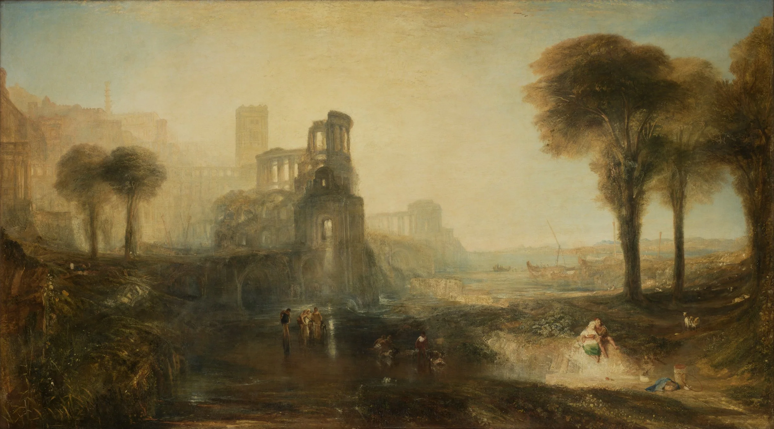
J.M.W. Turner, Caligula’s Palace and Bridge, exh. 1831. Image courtesy of Tate.
For an exhibition pitting them as rivals, none of the large exhibition pictures in Room 7 ever traded blows in the same year. We are given only one instance of this in the next room, where Constable’s ‘six-footer’ Salisbury Cathedral from the Meadows was once sandwiched between Turner’s Caligula’s Palace and Bridge and the Vision of Medea in the 1831 Summer Exhibition. Since contemporary critics paid little attention to the latter painting, it does not feature in the current show, a missed opportunity in the eyes of this reviewer since all three works are Tate-owned. Instead, the other corner of the room is given to Constable’s Hadleigh Castle and its sketch, a reunion that wonderfully demonstrates his dramatic and clean aesthetics. If Turner can be seen as a minimalist, Constable is a maximalist whose work is characterised by rich details, thick impasto, and grit, which can be seen in The Opening of Waterloo Bridge, shown for the first time in the next room with its small sketch since being in his studio.

Installation view of John Constable’s The Opening of Waterloo Bridge (1832) and it’s preparatory study in Turner and Constable: Rivals and Originals at Tate Britain. Photo © Tate Photography (Yili Liu).
Nonetheless, it is a treat to envisage what one Literary Gazette critic described as a clash of ‘[f]ire and water…the one all heat, the other all humidity, – who will deny that they both exhibit…some of the highest qualities of Art?’
As a kind of preface to their artistic legacies – Turner outlives Constable by 16 years – the penultimate room briefly explores their printmaking activities. A central display highlights the former’s Liber Studiorum – the subject of an exhibition last year at the Whitworth – and Constable’s English Landscape Scenery mezzotints with the engraver David Lucas. Here, the prints are in servitude of the paintings they reproduce or, in the case of Turner’s Norham Castle, Sunrise and Landscape with Walton Bridges, were painted decades later from compositions in the Liber Studiorum. It would have been a delight to see at least one example of a Lucas proof impression retouched and annotated by Constable to show his level of active involvement, a topic that is currently explored in a display at V&A South Kensington (until 14 June 2026). Nonetheless, few works exemplify his outstanding watercolour technique in his final years than Old Sarum and Stonehenge, an inseparable pairing featuring sweeping pigments, scratched out highlights, rainbows, and panoramic viewpoints reminiscent of Peter Paul Rubens.
The exhibition ultimately ends in the present, with a video containing reflections by Frank Bowling, Bridget Riley, Emma Stibbon, and George Shaw on how these two artists have shaped their own artistic journeys. But for visitors, this is the beginning of a reassessment to answer the nation’s favourite question: who do you like better?
The exhibition Turner & Constable: Rivals & Originals continues at Tate Britain, London, until 12 April.
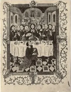
Medieval or not, that is the question. One of these works, depicting the Last Supper, is based on the other and reversed, but which is it?

-
The original is the right/lower image.
Left/Upper Image: an illuminated manuscript leaf by The Spanish Forger from Antiphonary MS M.786a, The Morgan Library & Museum, New York
Right/Lower Image: an illustration from Paul Lacroix, Vie militaire et religieuse au moyen âge et à l'époque de la Renaissance, Paris, Librairie de Firmin-Didot et Cie, 1877, p. 224, fig. 175
Although the left/upper drawing purports to be a medieval work – a page from an illuminated manuscript – and several centuries older than the lower image, it is actually a late nineteenth or early twentieth-century forgery by the so-called ‘Spanish Forger’. To deceive audiences, the artist used medieval sheets of parchment or vellum for his elegant courtly compositions, capitalising on an idealised chivalric conception of the Middle Ages and a vogue for medieval miniatures. He is believed to have worked in Paris at the turn of the twentieth century, and takes his misleading name from the misattribution of one of his paintings to a fifteenth-century Spanish artist. Although his deceit was unmasked by Belle da Costa Green, director of the Morgan Library, in 1930, the artist’s true identity remains a mystery.In this example, and in many others, the Forger appropriated ideas from chromolithographic editions published in Paris. Here, he reversed and elaborated an image of the Last Supper from Paul Lacroix’s Vie militaire (1877). The book was published by the Parisian firm Firmin Didot, and it has been suggested that the Forger was in the employ of the publishing house. To further the impression of age, the Forger altered and restored his own work.
Amongst the Forger’s giveaway signs was the prominent décolletage given to his courtly ladies, implausible in a medieval painting. Furthermore, the vibrant palette of blues, pinks, reds, and green (unfortunately not reproduced here), gave away the deceit. Technical analysis revealed that many of the colours used were not synthesised until the nineteenth century.
‘Every time you put a mark on a painting and you can’t take it off, you are running the risk of destroying the painting,’ says artist Glenn Brown. ‘But that’s what makes it exciting to paint.’ In the sixth episode of the Frieze Masters Podcast 2025, British artist Glenn Brown – who has pioneered the use of visual appropriation in his work – and curator Arturo Galansino discuss the jeopardy and excitement of mark-making, and what it means to collect, display and distort the work of old masters.
‘250 years since the birth of J.M.W. Turner, this film marks the end of decades-long cataloguing project that has transformed how we see one of Britain’s greatest artists. Commissioned by the PMC in collaboration with Tate, the film documents the final phase of cataloguing Turner’s 37,000 drawings, sketchbooks, and watercolours.
In March 2021, the Women of the Rijksmuseum Project was launched with the aims to redress the gender balance in the collection and recognise the role of women in art and history. The project has supported exhibitions, publications and acquisitions, organised symposia, and enriched object labels with new perspectives. On the project’s fifth anniversary, Hanna Klarenbeek, curator at Het Loo Palace, interviewed Jenny Reynaerts, chair of the project until her retirement in March 2025, together with Marion Anker and Laurien van der Werff – who succeeded her as co-chairs.