Turner & Constable: Rivals & Originals at Tate Britain, London
Trois Crayons Magazine, February 2026
Reviewed by Nigel Ip, Print Quarterly

For over 200 years, Joseph Mallord William Turner and John Constable have been entwined in a heated rivalry to become Britain’s favourite landscape painter. While the former’s self-portrait graces the latest £20 note in front of The Fighting Temeraire, Constable has received no such acclaim beyond local association with an area of the River Stour dubbed ‘Constable Country’.

Ramsay Richard Reinagle, John Constable, c. 1799. NPG 1786. © National Portrait Gallery, London.
Celebrating the 250th anniversary of the birth of both artists – born in 1775 and 1776, respectively – the exhibition at Tate Britain seeks to highlight their original contributions and divergent pathways towards the genre. Turner discovered fame early on as a city boy in London, becoming the youngest student at the time to be admitted into the Royal Academy Schools, aged 14, and a full Academician at 27. His commercial success helped fund his annual summer excursions abroad, resulting in a diverse portfolio of popular Grand Tour subjects with Claude Lorrain as his inspiration.
Constable, on the other hand, grew up in the Suffolk countryside, joined the Royal Academy Schools at 23 in 1799 – the same year Turner became an Associate – and was elected full Academician at 53. He never left Britain, despite achieving success in France in the 1820s, and went on sketching tours across the country, particularly the Peak District and Lake District. His affinity for Dutch artists like Jacob van Ruisdael drew his attention to depicting picturesque rivers and valleys, ruins and churches, and lush forests where the trees serve as protagonists in an epic tribute to the English countryside.
Taking advantage of its many international loans, especially from private collections, the backbone of the exhibition is its constant stream of related works grouped together from both artists’ oeuvres. In doing so, it excels in providing a more complete understanding of Turner and Constable’s inventive and technical processes, demonstrated by large concentrations of their drawings and sketchbooks in the first half. Among the early paintings also in these rooms is the recently rediscovered The Rising Squall, sold at Sotheby’s in July 2025. Not seen in 160 years, it featured in the 1793 Royal Academy Summer Exhibition and was Turner’s first publicly exhibited oil painting at the age of 17.
Turner’s teenage watercolours from 1790–91 were strongly influenced by his tutor, the architectural draughtsman Thomas Malton, and demonstrate his aptitude for framing interesting motifs using a low vantage point. While his application of colour is generally cautious, his figures are overly animated, resulting in a contrasted appearance reminiscent of a Thomas Rowlandson print. However, he learns very quickly over the next few years, creating atmospheric vistas with remarkably sensitive applications of colour wash. He also created a series of theatrical watercolours intended to be illuminated from behind; the one on display cleverly shows how layered applications of wash can reinforce tonal contrasts when lit, allowing areas like the sky and lantern to glow while the cottage and hut remain in shadow.
For an artist whom we often associate with his loose handling of paint, Turner’s draughtsmanship is surprisingly careful and rigid, perhaps informed by his teenage jobs in an architect’s office and as a copyist of landscape watercolours. His pocket sketchbooks are filled with drawings of buildings and ancient ruins, copies of Old Master paintings, as well as practical information like maps and language notes to assist him on his travels. Meanwhile, the larger sketchbooks often contain views of lakes and mountain ranges, first drawn as lines with graphite and then partially completed with washes. When viewed alongside his ‘colour beginnings’, which serve as studies for modelling light and colour effects, Turner emerges as a methodical artist who understands how precise linework and details affect the viewer’s perception of tonal ambience. As one traverses to his late watercolours, a ‘less is more’ approach becomes more evident, with compositions being cleaner, washes becoming thinner but more visually complex, and a return to the mystery of unfinished passages.

J.M.W. Turner’s fishing rod in Turner and Constable: Rivals and Originals at Tate Britain. Photo © Tate Photography (Yili Liu).
Meanwhile, Constable’s draughtsmanship embraces the expressive potential of the monochrome, favouring graphite, black chalk, charcoal, and black lead. His arsenal consists of different forms of hatching and the varying of pressure applied to his pencil to fully exploit the effects of chiaroscuro (light and shade) in his atmospheric sketches of the Lakes or highly finished drawings like East Bergholt Church, from the southwest. Even the little illustrations in his sketchbooks look like fully formed vignettes suitable for reproduction in print.
One lovely ensemble is the gathering of Flatford Mill with its pencil tracing and oil sketch, shown together for the first time. The tracing, squared for transfer, derives from a glass sheet that Constable originally placed on his easel to view the scene and draw directly on its surface. His commitment to accuracy and perspective can also be seen in earlier drawings like Helmingham Dell and View along the River Brathway towards Skelwith Bridge. In the paintings, Constable’s addition of fictitious elements like fishermen to balance his compositions and create strong leading lines reveals his picturesque vision of the local surroundings, including fluffy, sunburst clouds.
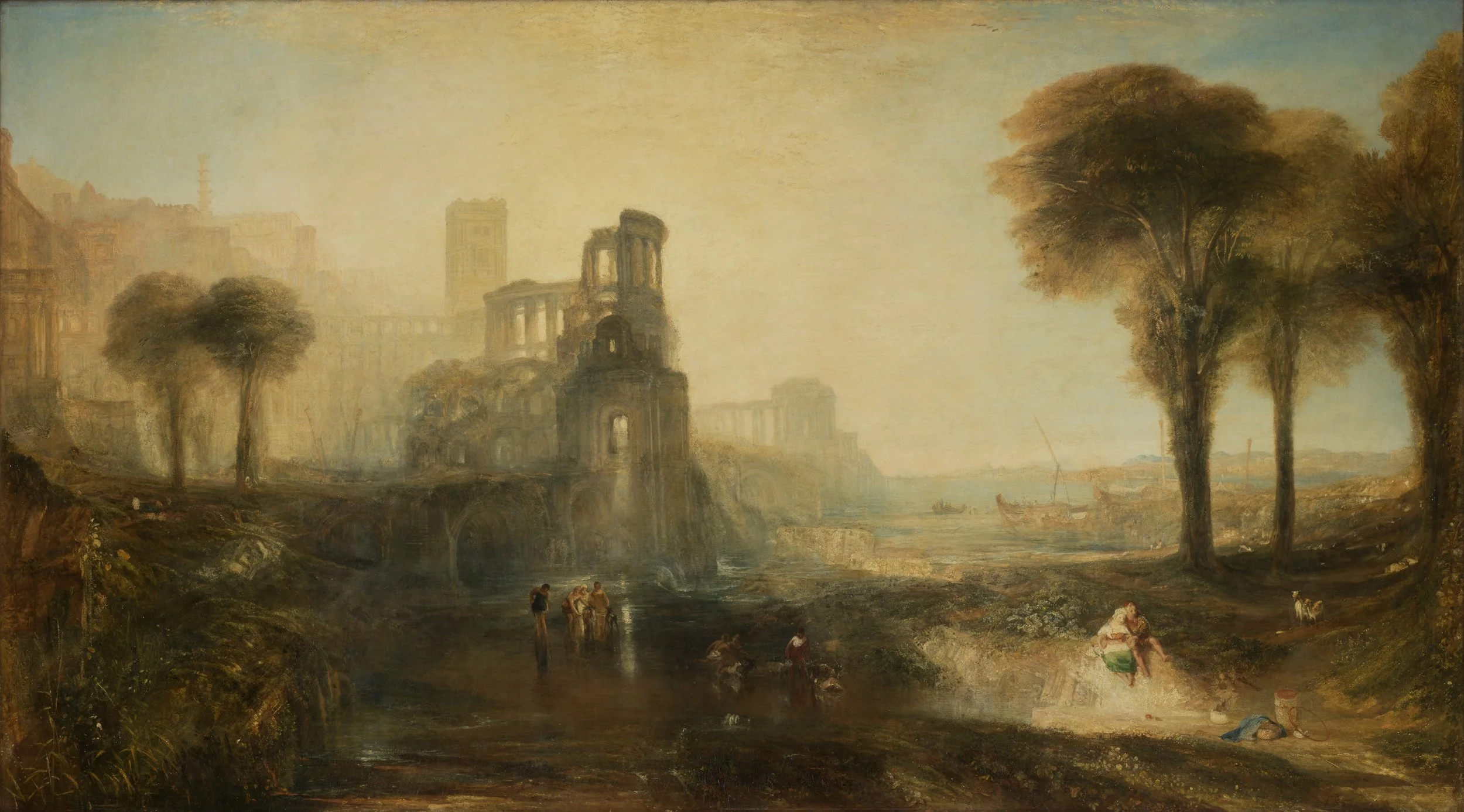
J.M.W. Turner, Caligula’s Palace and Bridge, exh. 1831. Image courtesy of Tate.
For an exhibition pitting them as rivals, none of the large exhibition pictures in Room 7 ever traded blows in the same year. We are given only one instance of this in the next room, where Constable’s ‘six-footer’ Salisbury Cathedral from the Meadows was once sandwiched between Turner’s Caligula’s Palace and Bridge and the Vision of Medea in the 1831 Summer Exhibition. Since contemporary critics paid little attention to the latter painting, it does not feature in the current show, a missed opportunity in the eyes of this reviewer since all three works are Tate-owned. Instead, the other corner of the room is given to Constable’s Hadleigh Castle and its sketch, a reunion that wonderfully demonstrates his dramatic and clean aesthetics. If Turner can be seen as a minimalist, Constable is a maximalist whose work is characterised by rich details, thick impasto, and grit, which can be seen in The Opening of Waterloo Bridge, shown for the first time in the next room with its small sketch since being in his studio.
Installation view of John Constable’s The Opening of Waterloo Bridge (1832) and it’s preparatory study in Turner and Constable: Rivals and Originals at Tate Britain. Photo © Tate Photography (Yili Liu).
Nonetheless, it is a treat to envisage what one Literary Gazette critic described as a clash of ‘[f]ire and water…the one all heat, the other all humidity, – who will deny that they both exhibit…some of the highest qualities of Art?’
As a kind of preface to their artistic legacies – Turner outlives Constable by 16 years – the penultimate room briefly explores their printmaking activities. A central display highlights the former’s Liber Studiorum – the subject of an exhibition last year at the Whitworth – and Constable’s English Landscape Scenery mezzotints with the engraver David Lucas. Here, the prints are in servitude of the paintings they reproduce or, in the case of Turner’s Norham Castle, Sunrise and Landscape with Walton Bridges, were painted decades later from compositions in the Liber Studiorum. It would have been a delight to see at least one example of a Lucas proof impression retouched and annotated by Constable to show his level of active involvement, a topic that is currently explored in a display at V&A South Kensington (until 14 June 2026). Nonetheless, few works exemplify his outstanding watercolour technique in his final years than Old Sarum and Stonehenge, an inseparable pairing featuring sweeping pigments, scratched out highlights, rainbows, and panoramic viewpoints reminiscent of Peter Paul Rubens.
The exhibition ultimately ends in the present, with a video containing reflections by Frank Bowling, Bridget Riley, Emma Stibbon, and George Shaw on how these two artists have shaped their own artistic journeys. But for visitors, this is the beginning of a reassessment to answer the nation’s favourite question: who do you like better?
Turner & Constable: Rivals & Originals continues at Tate Britain, London, until 12 April.