Rubens, Jordaens, van Dyck: Flemish Master Drawings
Kupferstichkabinett – Staatliche Museen zu Berlin
Trois Crayons Magazine, October 2026
Previewed by Dr Christien Melzer, Curator at the Kupferstichkabinett – Staatliche Museen zu Berlin
Christian Melzer, Curator at the Kupferstichkabinett – Staatliche Museen zu Berlin, Berlin in conversation with Editor Tom Nevile
Opening on 10 October, the Kupferstichkabinett in Berlin is hosting its first major exhibition of Flemish drawings in fifty years. Featuring more than 100 drawings by twenty-eight artists, the exhibition focuses on the period 1570–1650 and explores the origins of the Flemish Baroque, showcasing works by Antwerp’s celebrated trio Peter Paul Rubens, Jacob Jordaens and Anthony van Dyck, as well as many lesser-known names.
Christian Melzer reflects on the show’s goals, discoveries and the drawing she’d most like to take home with her.
Could you begin by describing the structure and layout of the exhibition? What curatorial story does it seek to tell and which narrative, thematic, or didactic threads have determined the arrangement?
The exhibition draws on the Kupferstichkabinett’s own holdings and includes only two loans: a painting by David Teniers the Younger from the Gemäldegalerie, which is presented alongside a preparatory sketch for the figures, and a book from the Kunstbibliothek of the Staatliche Museen zu Berlin.
Visitors are welcomed by a small selection of masterpieces by the three main protagonists: a few carefully chosen drawings by Rubens, Jordaens and van Dyck set the scene, before providing information on geography, history and the artistic context. The tour then features three further sections, each dedicated separately to one of the three great masters, showcasing ten to twenty drawings by each of them. From Rubens, for example, I have selected just about half of our holdings. These three main sections are complemented by further chapters: a short introductory section features drawings by precursors and pioneers, including drawings by two of Rubens’s teachers, Tobias Verhaecht and Otto van Veen. Other sections interspersed throughout contain smaller selections of works by contemporaries: Jan Brueghel the Elder, David Teniers the Younger, Sebastian Vrancx, Adriaen Brouwer and others, as well as pupils and collaborators of Rubens such as Abraham van Diepenbeeck and Erasmus Quellinus. The exhibition concludes with a chapter featuring landscapes, some of which were produced for the open market, including works by David Vinckboons, Daniël Seghers, Lucas van Uden, Lodewyck de Vadder and Jacques d’Arthois. These can be linked back to Verhaecht, Brueghel and Teniers, so that one can trace the development of the landscape as one sub-theme of the exhibition. I am also highlighting how the artists were connected to one another, how they collaborated and – not only within a small urban area, but in a wider regional context – contributed to a vibrant art scene.
Also important are the functions of the drawings and their role in the creative process leading up to the completion of a work, as explained in the accompanying individual texts: preparatory sketches for paintings and engravings, designs for tapestries; figure studies; compositional sketches; and copies of sculptures or paintings, as in the case of Rubens, for example. The fact that these drawings were (mostly) working materials is also evident from a number of sheets displayed on both sides. For example, the recto and verso of three of Rubens’s studies were created for completely different paintings and contexts.
The organisation of the exhibition is not strictly chronological as many of the artists were active at the same time; there is a great deal of freedom within the space, and visitors can walk back and forth between the sections. The exhibition features warm wall colours that are inspired by some of Jordaens’s tempera drawings. There are also large-scale close-ups that reveal just how much energy and visual impact is contained within these drawings.
My aim, above all, is to give the general public an idea of the diversity and vitality of Flemish – or rather South Netherlandish – drawing. The exhibition is less about questions of attribution than it is about aesthetic enjoyment, the spirit of collaboration and the fact that drawing was an essential part of the creative process. For children (and adults) who fancy having a go at drawing themselves, there’s also a free drawing and puzzle sheet with some ideas.
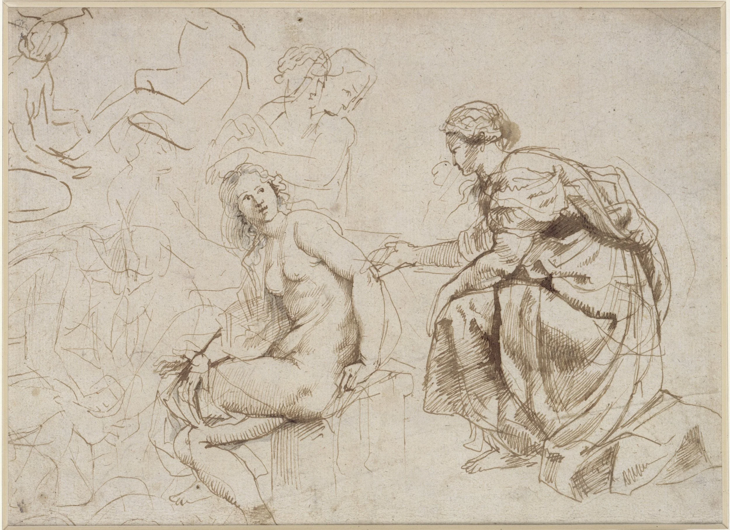
Peter Paul Rubens (1577–1640), Bathsheba Receives David's letter, Kupferstichkabinett, Staatliche Museen zu Berlin, Berlin, inv. KdZ 5397. Credit: Staatliche Museen zu Berlin, Kupferstichkabinett / Dietmar Katz Public Domain Mark 1.0
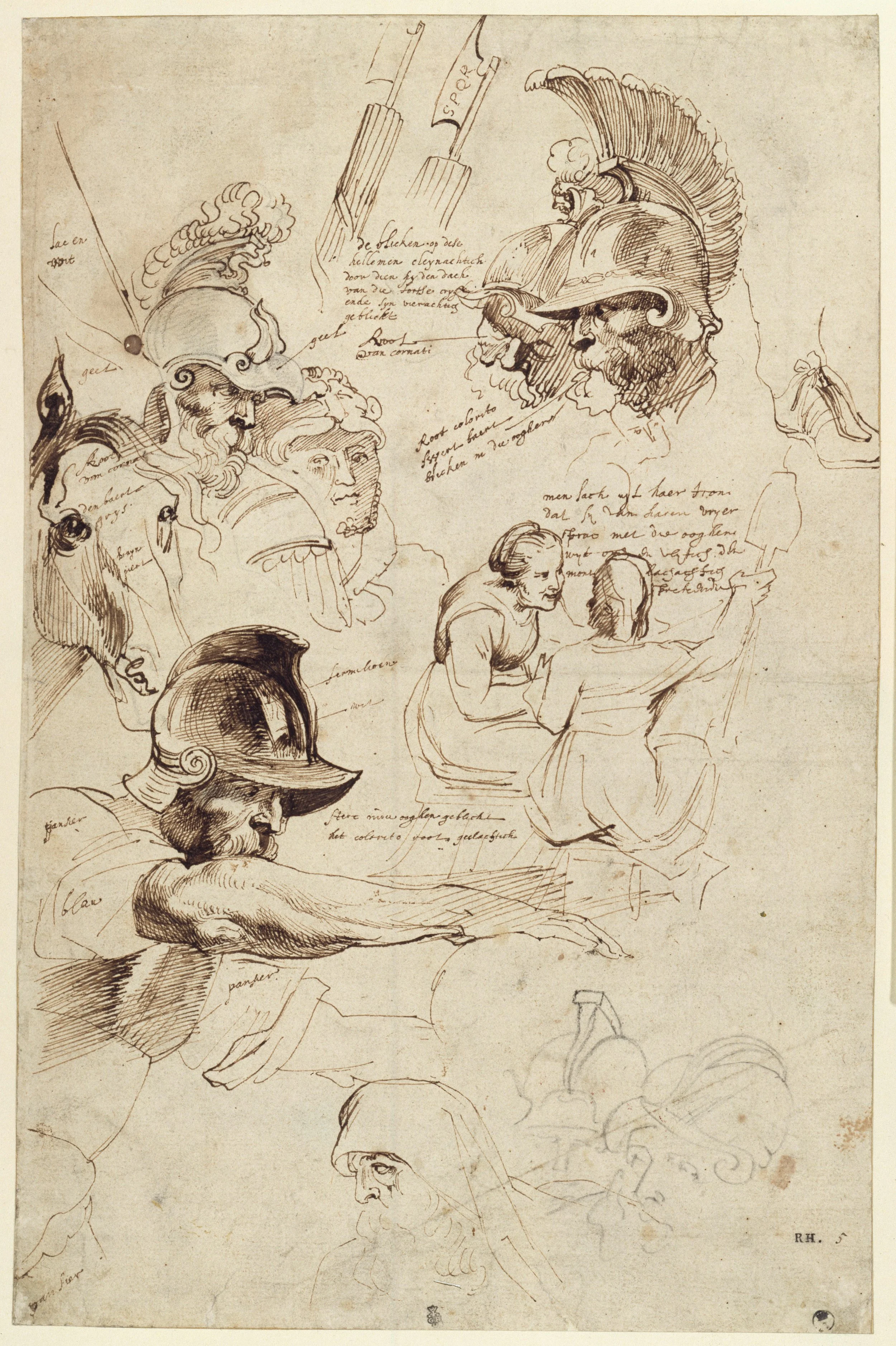
Anthony van Dyck (1599–1641), Sketch after Rubens' Painting in Munich: The Martyrdom of St. Lawrence, Staatliche Museen zu Berlin, Kupferstichkabinett, inv. KdZ 5686. Credit: Staatliche Museen zu Berlin, Kupferstichkabinett / Jörg P. Anders Public Domain Mark 1.0
In recent years, there have been several major Flemish drawing exhibitions across institutions like the Ashmolean, the British Museum, and the upcoming shows at the Courtauld Gallery and Rijksmuseum. What prompted the Kupferstichkabinett to return to the collection after fifty years? How has this revived interest affected your own research and exhibition presentation; and how have art historical perspectives evolved since the Kupferstichkabinett’s last exhibition in the 1970s.
For many years, the focus in Berlin has been on Dutch drawings, which is why I felt it was time for me to turn my attention to our Flemish drawings, make them available online and bring the documentation up to date with the latest research. Matthias Winner and Hans Mielke’s 1977 catalogue raisonné of Rubens’ drawings in Berlin by is, of course, excellent and continues to serve as an important reference work, but research into Rubens has advanced considerably with the Corpus Rubenianum, the most recent catalogues raisonné by Anne-Marie Logan and Kristin Lohse Belkin and several exhibition catalogues. There is a wealth of knowledge about Rubens’s drawings and many of ours have been loaned to various museums for major exhibitions. I would now like to finally display them here on site again. The same is true for Jan Brueghel the Elder and Anthony van Dyck. I am also very pleased that we are able to exhibit most of our Jordaens drawings. He is a fantastic draughtsman and a rediscovery for me too. Apart from two or three isolated exceptions, his drawings have never been exhibited in Berlin on such a scale before. There is certainly something surprising about seeing so much colour in old master drawings.
In times of tight budgets, we too are encouraged to organise exhibitions that attract a broad lay audience; big names such as Rubens, Jordaens and van Dyck are well known and can help to encourage people to visit the museum. Next year marks Rubens’s anniversary, so we’re getting a head start – and perhaps rightly so, given that Nils Büttner has suggested 1576 as a possible year of birth for Rubens in his research. This is not an exhibition based on many years of research for a collection catalogue or devoted to a specific research question – and in this respect, it differs from projects such as those at the Courtauld Gallery or the British Museum which are based on many years of thorough research – but rather an exhibition aimed at the general public which seeks to showcase our treasures. For this reason, the catalogue of just 100 pages is intended to accompany a walk through the exhibition rather than serve as a scholarly publication.
Although questions of attribution remain important (the 1977 exhibition catalogue was entitled ‘Originals, Circle, Copies’), they are by no means the only questions. Other aspects, such as workshop contexts, collaboration or the functions of drawings now play a more important role. To give an example: The portrait study of a lady, which was previously attributed to van Dyck, was rejected by Stijn Alsteens in his catalogue The Anatomy of Portraiture (2016) and classified as a copy after a painting by van Dyck. However, the drawing is of such quality that I decided to display it, despite its anonymity, alongside a portrait sketch of King Charles I of England on horseback by the artist’s own hand. In addition, an early sketch by van Dyck is on display in which he himself copies figures from a painting by Rubens and adds notes about colour, lighting and poses. This illustrates how artists mutually influence and inspire one another, how they experiment and adapt ideas to suit their own purposes. These drawings illustrate the creative process.
Last year, as part of the collaboration between the Prussian Cultural Heritage Foundation (Stiftung Preußischer Kulturbesitz) and the Gardens, Libraries and Museums of the University of Oxford, I was able to explore the drawing collections at the Ashmolean Museum and the Kupferstichkabinett in Berlin together with An van Camp. I saw and learnt a lot in the process; it was a real pleasure to look at the drawings together and we also discussed the selection for this exhibition. Nils Büttner also visits the Kupferstichkabinett regularly. In my view, working on the permanent collection has become much more collaborative; today it’s all about working together, looking at things together, discussing, exchanging ideas and, ultimately, inspiring the audience. Remarkably, this is reflected in the concept of the artists’ network, which features in the exhibition.
Did the research process yield any surprises, or lead to any discoveries that are being presented to the public for the first time?
It was great fun exploring the Flemish holdings of the Kupferstichkabinett. In the end, however, I unfortunately had to limit myself to between 100 and 110 works, as the exhibition space simply cannot accommodate more. In the so-called ‘Zweite Garnitur’, for example, I found a study of a dog that can be attributed to Frans Snyders, but which did not make it into the exhibition.
I made a wonderful discovery in the album (Stammbuch) of the Braunschweig publisher Gottfried Müller. He travelled several times to the Netherlands between 1616 and 1618 and had various artists fill the pages of his album. Some entries are dated, some are signed, sometimes Müller added the names himself which makes it possible to determine the cities he visited. Whilst leafing through the book, I came across a page that partially reproduces a drawing by Jan Brueghel the Elder depicting a bustling village street, from the collection of the Kupferstichkabinett. The Brueghel drawing can now be dated to before 1618, by that time Müller had returned from the Netherlands at the latest. The drawing in the album is a fine copy in brown pen and blue wash, perhaps by a workshop assistant. He (or she) must definitely have had our Brueghel drawing at hand. The landscape format was adapted to the almost square page size of the book, a few details such as the pecking hens were adjusted, other minor elements such as a dog wagging its tail were omitted. Two seated figures in the left margin were added to balance the slightly modified composition. It is certainly interesting to imagine Müller asking for a drawing for his album in Brueghel’s Antwerp workshop, and perhaps even choosing a subject himself, which an assistant would then execute as closely as possible to the original. Both the page of the book with the copy and the original drawing are now on display together.
Further connections have emerged within the collection, such as between a study of a nude woman by Jordaens and his composition sketch depicting Venus mourning the dead Adonis. The goddess of beauty has almost the same pose and body proportions as the figure study. Both are displayed side by side now.
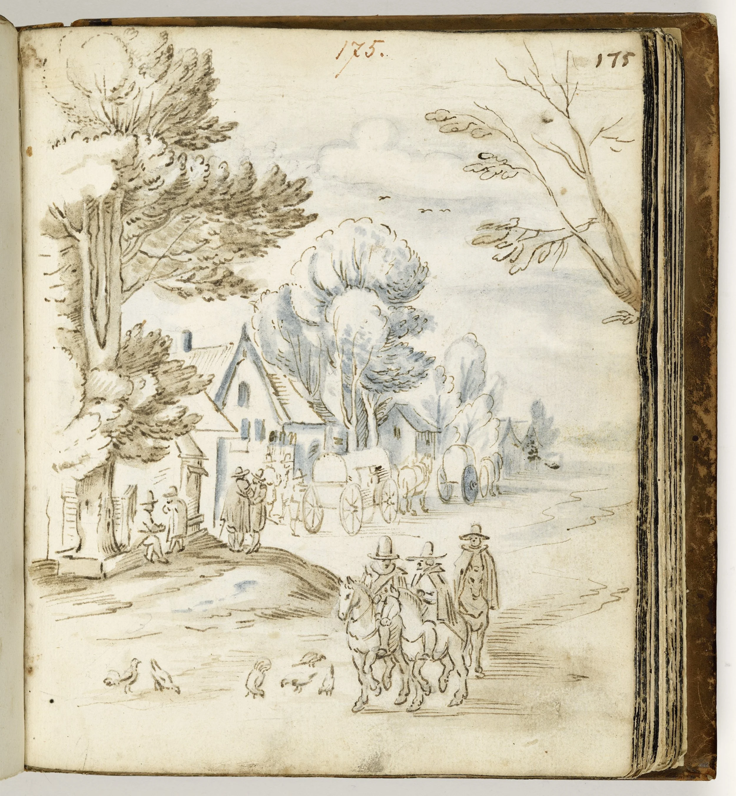
after Jan Brueghel the Elder (1568–1625), Busy Village Street. From the Stammbuch of Gottfried Müller, Kupferstichkabinett, Staatliche Museen zu Berlin, Berlin, inv. 79 A 8, fol. 175. Credit: Staatliche Museen zu Berlin, Kupferstichkabinett / Dietmar Katz Public Domain Mark 1.0
Was there a conservation campaign that formed part of the exhibition preparation? If so, what were the most significant or unusual discoveries to emerge from the process?
In the preparation for the exhibition only the usual measures were taken by my colleague, conservator Antje Penz, to make the drawings suitable for display; no in-depth material analyses were carried out. However, some sheets were removed from their old passe-partouts, all the watermarks were documented – including two different elephants, featuring in a drawing by Verhaecht and Rubens and a curious cuttlefish watermark in a sheet by Teniers. Some of the fragile van Dyck drawings in iron gall ink required stabilisation. However, whilst removing the drawings from their old mounts, we did make two discoveries that have not been documented so far: on the reverse of Jacob Jordaens’ The Feast of the Bean King, a sketch in black chalk depicting figures bathing came to light. On the reverse of another drawing by Jordaens, depicting a kneeling apostle for his Assumption of the Virgin (Museum of Fine Arts, Ghent), we found a rough sketch in chalk and purple brushstrokes showing (cropped) figures.
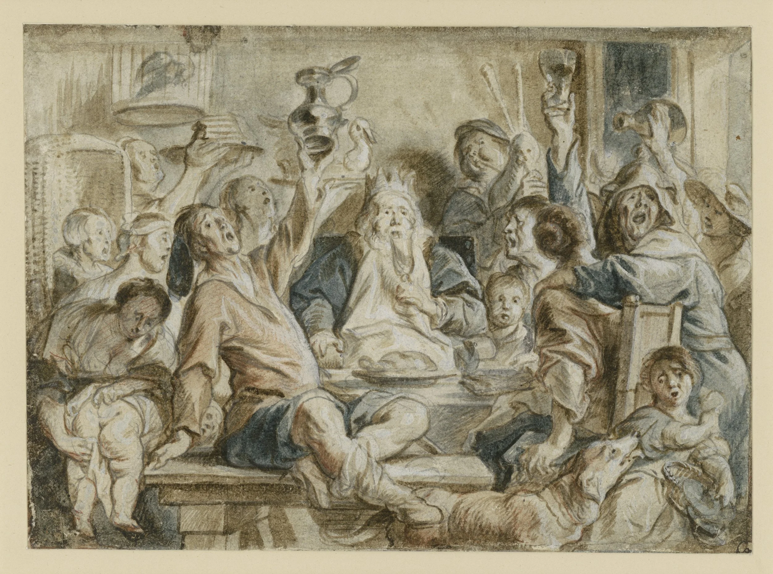
Jacob Jordaens (1593–1678), The Feast of the Bean King, Staatliche Museen zu Berlin, Berlin, inv. Kdz 2821. Credit: Staatliche Museen zu Berlin, Kupferstichkabinett / Dietmar Katz Public Domain Mark 1.0
The exhibition places Rubens alongside his teachers, pupils, rivals, and engravers, such as van Dyck and Jordaens. How does the selection of drawings illustrate the collaborative and at times competitive nature of the seventeenth-century Antwerp workshop system? Which other artists emerge as stars in their own right in this show?
The collections in Berlin are outstanding, which is a real privilege for me. Their wealth has enabled me to select several drawings from a larger corpus of works by many artists, so that one really gets a sense of the diversity even within a single artist’s oeuvre. Whilst Rubens is undoubtedly the dominant artistic figure, it nonetheless becomes clear that many of the draughtsmen have a very distinctive style of their own. Jordaens and Teniers have an unmistakable style, whilst Theodor Rombouts is far more influenced by his time in Italy than by Rubens. The Brussels landscape painters drew inspiration from Brueghel, Vinckboons and Coninxloo – besides Rubens. It is important to me that, alongside the great, well-known masters, lesser-known artists are also represented in the exhibition with a couple of works each: Abraham van Diepenbeeck with his characteristic drawings heightened with opaque white and figures, which are very reminiscent of Rubens, Pieter de Jode with his detailed preparatory drawings for engravings, Adriaen Brouwer with his quickly sketched, witty figure studies, Lucas van Uden, whose work has been overlooked by researchers, with his calm, idealised watercolour landscapes that seem to stretch far into the distance and certainly met a demand – the exhibition really does offer a wide range of themes, techniques and approaches to drawing.
Furthermore, the exhibition texts and labels repeatedly refer to collaborations between different artists. In addition, our design team has created a wall graphic that illustrates the relationships between the artists through a complex network: apprenticeship, collaboration and kinship. As already mentioned, the spatial design is open, allowing views through, forward and backward to other sections which establish connections between the individuals and the works. It is not easy to bring this complex structure to life in an exhibition that visitors walk through from start to finish – especially as the drawings rarely show direct collaboration, such as a painting created jointly by Rubens and Brueghel. Much of it has to be simplified and condensed, but I think we can still convey an impression of this incredibly productive cultural space.
The Counter-Reformation, globalisation and political turmoil of the Eighty Years’ War (1568–1648) are linked with the rise of a prosperous, bourgeois class in Antwerp and the growth of the Flemish Baroque. How did this blend of expanding commercial wealth and geopolitical conflict shape the art of the period – and how is that reflected in the specialised genres on display?
Times were indeed difficult, and the lines of conflict are, in some cases, directly reflected in the works on display. We are exhibiting a map in the shape of a lion (Leo Belgicus) by Frans Hogenberg, bound into a book on the history and topography of the Netherlands. The book, written by the Austrian scholar Michael II. Freiherr von Aitzing – nobleman, devout Catholic and loyal supporter of the Spanish Crown – documents the Dutch revolt against Spanish rule. Dated 1583, the map is the oldest image of its kind. The coastline of the North Sea forms the contour of the animal’s back, while Antwerp lies at shoulder height. At the beginning of the Eighty Years’ War, the map represented the unity of the northern and southern provinces but it was patriotically reinterpreted over the course of the war and in its various editions.
Two drawings by Sebastian Vrancx, who served as an officer in the Antwerp militia and who is considered the founder of Flemish military painting, show the brutality of war. Against the backdrop of ongoing conflict with Spain, scenes of plundering were especially marketable: One scene depicts the looting of a village, with gruesome details, a composition that has survived in five other versions and was probably produced serially, as well as a study sheet with musketeers handling their weapons.
In other works, the political unrest is present on a subconscious level: A drawing of a sumptuous still life is derived from one of Frans Snyders’ brightly coloured renderings of a pantry, a motif the artist first developed during the peaceful, optimistic period of the Twelve Years’ Truce (1609–21). For seventeenth-century viewers, such an arrangement conveyed not only prosperity and the pleasures of country life, but also the transience of all earthly existence. It shows the abundance of creation and corresponds to poems that glorify peaceful country life.
The rise of the wealthy middle classes is, of course, reflected in works such as Jan Brueghel’s gouache depicting a river landscape, an autograph replica based on a painting of the same size on copper (now in the Galleria Sabauda, Turin). The realistic composition, full of luxuriant vegetation and lively figures, captures the character of his homeland. Brueghel ran a successful workshop that served the growing demand from the bourgeois middle class for small-scale cabinet pictures characterised by a wealth of detail and painterly refinement. The gouache depicts an elegantly dressed couple on the riverbank in the centre – possibly the couple who commissioned the work.
At the same time, preparatory sketches by Rubens are on display, created at the height of his diplomatic career for the Spanish king. The children’s heads on the verso of a study sheet were drawn after the children of his friend Baltahazar Gerbier, a diplomat, painter, and art collector in the service of the duke of Buckingham. They are preparatory studies for two children in the painting Minerva protects Pax from Mars (Peace and War, now in the National Gallery, London), which Rubens gave to King Charles I of England on behalf of Spain to further peace negotiations. These few examples show just how much contemporary history can be reflected even in drawings.
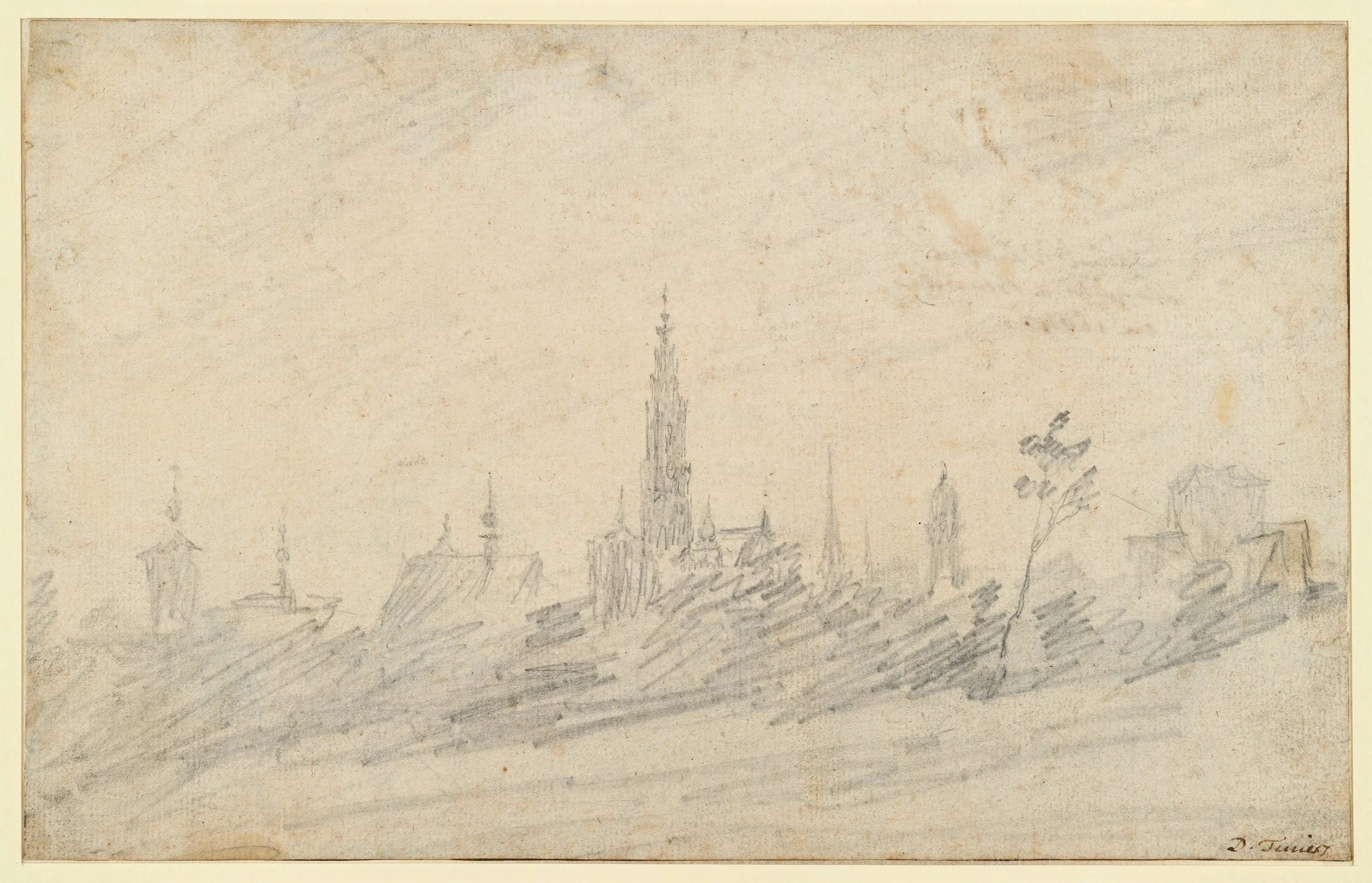
David Teniers the Elder (1610–1690), View of Antwerp, Staatliche Museen zu Berlin, Berlin, inv. Kdz 6414. Credit: Staatliche Museen zu Berlin, Kupferstichkabinett / Dietmar Katz Public Domain Mark 1.0
If you could choose one drawing from the exhibition to take home with you, what would it be and why?
That’s a difficult question, because the more knowledge you acquire, the more interesting even seemingly marginal drawings become. If I could, I’d probably choose several. Jordaens’ coloured designs for tapestries are very tempting, but ultimately, I might just go for Teniers’ View of Antwerp executed in graphite. At the centre of the urban silhouette is the late Gothic north tower of the Cathedral of Our Lady. Despite the rapid, seemingly cursory style of drawing, Teniers’s characterisation of the roofs and towers is marked by accuracy and confidence. It is a marvellous drawing, incredibly fresh and almost impressionistic; the only view of Antwerp by Teniers we know, which he later used as a background for several paintings.
Rubens, Jordaens, van Dyck: Flemish Master Drawings is open at the Kupferstichkabinett – Staatliche Museen zu Berlin, from 10 October – 31 January 2027. The accompanying catalogue is available now.