January 2024
Monday, January 1
Trois Crayons (French, "three crayons") The technique of drawing with black, white and red chalks (à trois crayons) on a paper of middle tone, for example mid-blue or buff. It was particularly popular in early and mid-18th century France with artists such as Antoine Watteau and François Boucher. (Clarke, The Concise Oxford Dictionary of Art Terms)
Coming Up
Dear all,
Greetings from Trois Crayons HQ and a happy New Year to all. We hope that everyone has enjoyed a peaceful and restorative break.
This pause in proceedings seems a good time for us to announce some personal news. We are delighted to have partnered with The Drawing Foundation, ahead of Master Drawings New York, who are organising the events programming for the week which will run from 27th January – 3rd February. The exhibitors, event locations and much more can be viewed here. Some final housekeeping to attend to: our readers will be pleased to know that the Archive section of our website is now fully functional and so all the recurring segments of this newsletter can be viewed together in isolation.
In drawings news, the Fondation Custodia in Paris has announced the appointment of Stijn Alsteens as its incoming director, following the tragic death of Ger Luitjen in late 2022. All the best, Stijn. Fittingly, the Rijksmuseum are currently exhibiting a suite of four recently acquired drawings by Adriaen de Weerdt in Luitjen’s honour. The display is a compliment to the newly donated Rembrandt copper plate, a gift from Simon Schama and Virginia Papaioannou, which will be on view until May 26th. The Metropolitan Museum has also received a “Transformative Holiday Gift of Over 200 Superlative Paintings, Drawings, Sculptures” from the collector Dick Wolf. The full list of drawings is unpublished although the press-release alludes to rich holdings of Italian drawings from the 15th to 18th centuries, including exceptional works by Guercino and members of the Tiepolo family.
Casting our eyes forward to the late January auctions - “Masters” or “Classic” week, depending on your persuasion - Sotheby’s have published the digital catalogue of their flagship “Master Works on Paper from Five Centuries” sale, as well as works from the estate of Jimmy Younger and the collection of Joseph Baillio, whilst the full catalogue of the Christie’s sale remains teasingly unpublished. Stay refreshed here for updates.
For this month’s newsletter we have picked out 6 events from around the world and spotlit the programme of talks organised by the Drawing Foundation for Master Drawings New York. Our editor explores the ideas of Erwin Panofsky and speaks with Dominique Radrizzani, former director of the Musée Jenisch Vevey, about his favourite drawing in the museum’s new “Disegno Disegni” exhibition. Returning reviewer Nigel Ip casts his eye over ‘Impressionists on Paper’ at the Royal Academy and the customary selection of literary and audio highlights is followed, as ever, by our real or fake section.
If you have any comments, recommendations, or event listings, please do send them on to tom@troiscrayons.art.
EVENTS
For a more comprehensive overview of ongoing exhibitions and talks, please visit our new Events page.
MASTER DRAWINGS NEW YORK
Wordlwide
Drawing of the Month

Antonio d’Enrico, called Tanzio da Varallo (c. 1582-1633)
Study of a female nude bust (Eve?), hands crossed on the chest and supported by two arms
Red chalk, 156 x 129 mm, Musée Jenisch Vevey, Vevey, Inv. no.: 2015-254
Dominique Radrizzani, former director of the Musée Jenisch Vevey, has kindly chosen our fourth drawing of the month.
On December 7, 2023, the exhibition "Disegno Disegni" was inaugurated at the Musée Jenisch Vevey, an institution I once directed. In the exhibition, Italian drawings from a private collection meet those of the museum, for which I co-authored the first scholarly catalogue with Giulio Bora – let us acknowledge him in passing – in 1997 (“Cinq siècles de dessins”). After some deliberation over the choice of drawing (there is a very beautiful Perino del Vaga in the exhibition), I have decided on a "new" drawing, which was absent from the 1997 catalogue for the simple reason that it was only acquired in 2015!
As a draughtsman, Tanzio da Varallo is mostly known for his red chalk studies of details intended for paintings. This beautiful nude study relates to the fresco in the Chapel of the Guardian Angel (Cappella dell’Angelo Custode), sometimes called the Nazari Chapel after its patron, Ottavio Nazari, in the Basilica of San Gaudenzio in Novara. The centre of the barrel vault shows Christ between the Virgin and Saint Gaudentius. On either side are musical angels, and in the lower register are souls led by angels to Purgatory. On the left there are men and on the right, women.
Dated February 19, 1627, in the house of Ottavio Nazari, the contract for the fresco lays out technical and financial conditions. With a few significant variations, the drawing details the main group in the lower register on the right: a woman (sometimes identified as Eve) led by an angel.
Facing the Chapel of Good Death (Cappella della Buona Morte) painted by the recently deceased Morazzone (1573-1626), Tanzio strives to compete with the late Mannerist Lombard by presenting a language of physical corporality, felt even in the red chalk used here, where the powerful chiaroscuro modelling and pre-photographic realism betray the influence of Caravaggio.
The exhibition “Disegno Disegni” continues at the Musée Jenisch Vevey until April 14, 2024. The catalogue, “Disegno Disegni: Dessins Italiens de la Renaissance au XIXe siècle”, to which Dominique contributed, is available now through Silvana Editoriale, Milan.
Review

Impressionists on Paper (25 Nov 2023 – 10 Mar 2024)
The Royal Academy, London
reviewed by: Nigel Ip (Print Quarterly)
Image: Mary Cassatt, Portrait de Marie-Thérèse Gaillard, 1894. Pastel on paper, 51 x 54 cm. Private collection. Photo: © 2007 Christie’s Images Limited
In the eight Impressionist exhibitions held in Paris between 1874 and 1886, works on paper outnumbered oil paintings; this is rarely the case for modern displays exploring this period. Impressionists on Paper: Degas to Toulouse-Lautrec at the Royal Academy of Arts revitalises their interest for a general audience, keeping captions to a minimum so we can contemplate the visual impact of their material qualities.
Featuring 77 drawings across three large rooms, there are pastel seascapes from Claude Monet, chalk figure studies by Camille Pissarro and Paul Cézanne, and, of course, a reed pen landscape from Vincent van Gogh. Five drawings comprehensively encapsulate the latter’s draughtsmanship, including The Fortifications of Paris with Houses (1887) which was stolen from the Whitworth in 2003.
Some categories, such as fan designs, are almost exclusive to works on paper. Inspired by Japanese fan prints (uchiwa-e) and the French Rococo, artists like Jean-Louis Forain and Paul Gauguin experimented with this unique compositional format. Watercolour and gouache ensured their designs remained bold and vibrant.
A constant throughout the exhibition is Edgar Degas’ unwavering capacity to combine different types of media to great effect. In Ludovic Halévy Finds Madame Cardinal in the Dressing Room (1876-77), drawing and printmaking cross paths in a monotype embellished with coloured pastels and graphite. The hang also highlights the grand scale of Degas’ ballet dancers, some two or three times larger than the other exhibited works. Additionally, his preference for coloured backgrounds comes across in the pink and green supports of Dancer Seen from Behind (c.1873) and Dancer Yawning (Dancer Stretching) (1873).
Of the many drawing media represented, some felt new or unexpected. Essence, a form of diluted oil paint, was popular with Degas and Henri de Toulouse-Lautrec for its fast drying times and matte appearance. In Toulouse-Lautrec’s Woman with a Black Boa (1892), essence resembles gouache when thickly applied, and a dry wash when used lightly. Furthermore, historic media like tempera and leadpoint formed Pissarro’s and Edouard Manet’s arsenal, respectively.
Some groupings were especially enlightening, as in the wall of Georges Seurat’s monochrome drawings. Comparing his black Conté crayon study for the Bathers at Asnières (1884) with The Gleaners (c.1882), one can really appreciate the medium’s transition from a rough texture to a smokey aesthetic. However, charcoal still does this best, exemplified by Albert Lebourg’s The Artist’s Wife and Mother-in-law Reading a Letter by Candlelight (c.1878-79) with its strong contrasts and soft tonal gradations.
Finally, the allure of coloured pastels is hard to resist. For example, the carefully built up, blended layers of Mary Cassatt’s Portrait of Marie-Thérèse Gaillard (1894), Federico Zandomeneghi’s Waking Up (1895), and Jacques-Emile Blanche’s Portrait of Madame Henri Wallet (1887). The exhibition is worth it for this trio alone.
DEMYSTIFYING DRAWINGS
How To: Read a drawing
In this first article in a recurring series exploring “ways of looking”, our editor examines the ideas of Erwin Panofsky (1892 – 1968), a pioneer in the field of Iconology.
Studies in Iconology
In early December I attended a lecture at the Royal Academy of Arts in London delivered by Greg Rubinstein, head of Old Master drawings at Sotheby’s. In his talk on the process of cataloguing (or “categorising”) drawings, he spoke of three basic “functions” that can typically be assigned a drawing: study; preparation for another work; and independent exercise. As a cataloguer myself, I nodded along in tacit agreement. My friend however, an artist, took umbrage at the notion and at the cataloguer’s duteous need to define and categorise. It was hardly a Kuhnian moment, but it gave me pause for thought on the many ways in which the same drawing can be viewed, understood and enjoyed.
On the surface, an encounter with a drawing sparks a raw emotional engagement which can be shaped by innumerable factors: the location, prior knowledge of an artist’s work, the context, the framing, the lighting and so on. Whether it be positive or negative, this initial encounter demands a response. Even apathy is a response. Following on from that, the appreciation of a drawing can also arrive at various levels: the appreciation of a pure image; the appreciation of an artist’s skill; the appreciation of the chosen subject matter and its interpretation; the appreciation of the work through knowledge of its wider context and so on. All of these forms are valid and can arrive without total comprehension of the drawing’s “function”, or “intrinsic meaning”.
Much like a drawing’s “function”, the search for an artwork’s “intrinsic meaning” has often been systematised by the art historian. In 1939 the “iconologist”, Erwin Panofsky, proposed a theory of visualisation and interpretation intended to provide a framework for addressing exactly this point. No doubt my artist-friend will deplore this method of looking just as much as the function-lead approach. For one, it largely ignores aesthetics, and an artist’s skill. It is also more relevant to complete compositions rather than preparatory studies and exploratory exercises. But let us put these caveats aside for now as the framework still provides a fascinating approach for teasing out the secrets of the Old Masters.
In Panofsky’s theoretical manifesto, he establishes three spheres through which we interpret a work of art: primary; iconographical; and iconological. By recognition of the primary forms, identification of the icons and interpretation of the historical, social and cultural conditions conducive to its creation we arrive at Panofsky’s “intrinsic meaning”.
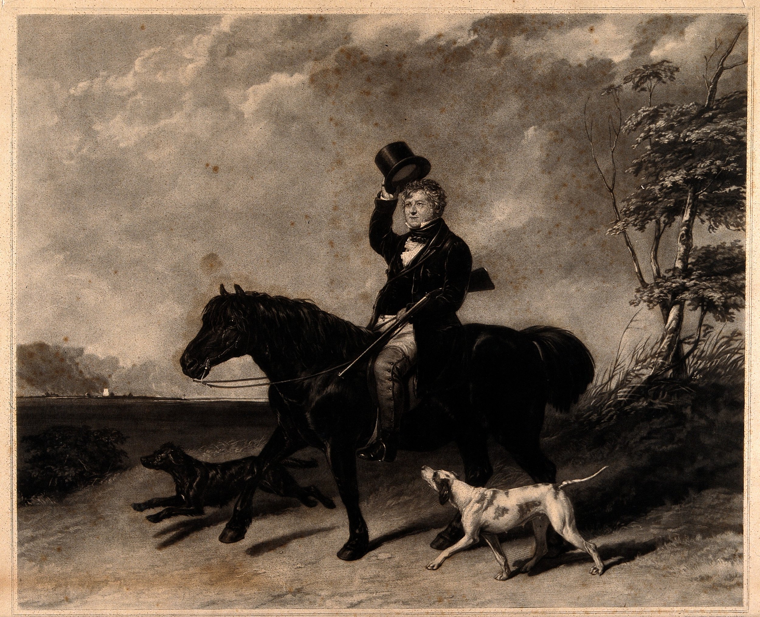
Step 1A: Primary or Natural. Pre-Iconographic.
The understanding that configurations of lines and colours are representations of natural objects. In non-abstract art the comprehension of these pure forms is often an intrinsic process.
Understanding that a drawing, comprising of lines and colours, depicts a man holding a bowler hat near his head.
Step 1B: Primary or Natural. Pre-Iconographic.
The recognition of a gesture, pose or mood in the objects represented.
Recognition that the man holding the bowler hat has a kindly look and has lifted it toward the viewer.
Step 2: Secondary or Conventional. Iconography
The pairing of the motifs identified with the world of themes and concepts, stories and allegories, understood through knowledge of literary and cultural sources.
Understanding that this is not just a man lifting a bowler hat, but a man politely greeting you through this action.
Step 3: TERTIARY OR INTRINSIC. Iconology.
The interpretation of pure forms, motifs, images, stories and allegories as manifestations of underlying principles, ‘symbolical’ values, which reveal the “basic attitude of a nation, period, class, religious or philosophical persuasion – unconsciously qualified by one personality and condensed into one work”.
Understanding that this man’s “polite gesture” is conditioned by his period, nationality, class, intellectual and cultural traditions.
Real or Fake
Can we fool you? The term “fake” may be slightly sensationalist when it comes to old drawings. Copying originals and prints has long formed a key part of an artist’s education and with the passing of time the distinction between the two can be innocently mistaken.


Although this artist was identified through a group of homogenously handled drawings in the style of Raphael and Timoteo Viti in 1913 by the German art historian, Oskar Fischel, the true identity of the forger remains unknown. Fischel’s 1927 publication in the Burlington Magazine speculated that the author of the group may be an English artist of the early 18th century, although more popular hypotheses propose that the artist is a 17th century Italian.
Whilst some drawings by the artist appear to be honest copies, near facsimiles of original drawings by Raphael and his associate, Viti, others are more interpretative and their purpose open to misconstruction. One drawing by the artist entered the collection of the famous French collector Pierre Crozat (and subsequently the Nationalmuseum, Stockholm) as an original Viti. It was even engraved and reproduced as such. It was not until the discovery of Viti’s true original and its subsequent acquisition by Samuel Woodburn that the Crozat drawing was recognised as a copy, however.
The present example is another case in point. One drawing has been identified as a copy, the other, also acquired by Woodburn, is the original drawing. But which is which?
Scroll to the end of the newsletter for answers.
Resources and Recommendations
to listen
The Professor: Hunting for the Mafia’s Missing Masterpiece
“Thomas Crown meets the Godfather”. More subterfuge and double-dealings this month as Simon Willis plunges into the Sicilian underworld in a four-part podcast series tracing the fate of William Veres, numismatist on trial for antiquities trafficking, and his attempt to find Caravaggio’s stolen Nativity, long believed to be in the hands of Cosa Nostra, in an attempt to clear his name.
Listen on Spotify, Apple Podcasts and Youtube.
to watch
The Royal Artists: Waldemar's Deep Dive On Holbein, Rubens & Dobson | Perspective
Waldemar Januszczak delves deep into the lives of Holbein, Rubens & Dobson in three hour-long documentaries, kindly provided free of charge by Perspective on Youtube. If Januszczak’s presentation style is to your liking then there is good news and something to look out for at the end of the month: a new series on Mannerism, scheduled for 30th January 2024 on Sky Arts.
to read
RKD Studies: Frans Hals and his Workshop
For those unable to make it to London to see the Frans Hals show at the National Gallery, fear not. The RKD (Netherlands Institute for Art History) has just published an extensive study on the artist and his workshop. Hals’ relationship with artists like Judith Leyster and Willem Buytewech is explored and the extent of his workshop collaboration in large-scale militia paintings is also examined. Drawings feature sparingly, as Hals left none and was known to paint directly on canvas, “alla prima”, in certain instances. There is some hope for the more optimistic, however. Drawings were certainly provided as models for workshop use and indeed preparatory studies for portraits were likely used too, as in the Leiden Collection’s Portrait of Samuel Ampzing. They must be out there somewhere!
answer
The original, of course, is by Timoteo Viti, and it is on the right (the lower image if you are viewing on mobile). It is now held in the British Museum, London (inv. no.: 1946,0713.79).
The author of the copy, to the left, is known as the “Calligraphic Forger (of Raphael)”. It is held in the Louvre, Paris (inv. no.: 4348).
The addition of drapery to Raphael and Viti’s nude models is often seen as a giveaway sign of the forger’s hand. A group of the forger’s drawings can be seen in the Nationalmuseum in Stockholm, which come from Crozat.